
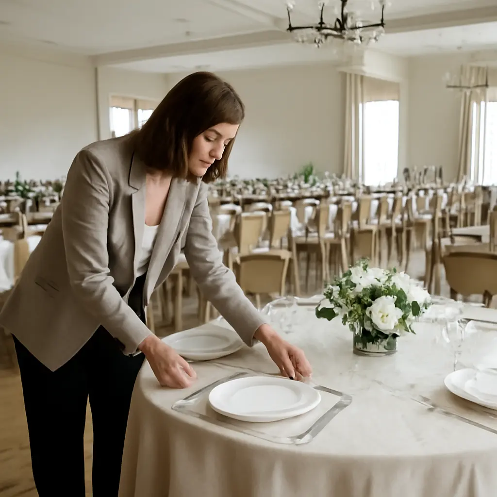
Minimalist weddings rely on restraint: a limited palette, purposeful details, and room for the ceremony and gathering to take center stage. They go wrong when “simple” tables are crowded with décor or when too many competing colors dilute the look. That distinction matters in a wedding market where The Knot’s 2024 Real Weddings Study reported an average U.S. wedding cost of $33,000 for celebrations held in 2023: thoughtful choices can make a restrained design feel intentional without adding more objects or expense. The principles below explain how to edit tablescapes, choose a coherent palette, and apply both to real reception settings.
Minimalist wedding design depends on intentional restraint
Minimalist wedding design is an approach that reduces visual elements while preserving function, atmosphere, and personal meaning. It is not simply an empty room or a table with very few decorations. The American Institute of Graphic Arts’ principles of design offer a useful parallel: visual hierarchy, balance, and contrast help people understand what deserves attention. Applied to a reception, those ideas mean choosing a clear focal point—such as the meal, a floral arrangement, or candlelight—and letting supporting details serve it rather than compete with it.
The most useful test is whether each item contributes to the guest experience or the overall composition. A place card helps guests find their seats; a fifth decorative object beside it may add little. Editing does not require eliminating warmth. Texture, natural materials, and a carefully chosen accent can make a minimal setting feel welcoming rather than bare.
Visual hierarchy gives the eye a place to rest
Visual hierarchy is the arrangement of elements so that some attract attention first and others read as supporting details. For a wedding table, that might mean one low floral centerpiece, simple place settings, and a restrained menu card. When every element is a focal point—ornate chargers, patterned linens, elaborate stationery, and tall flowers—the eye has no clear path through the scene.
Negative space is a design element, not unfinished décor
Negative space is the visible room around and between objects. On a reception table, it leaves practical space for plates, glassware, shared dishes, and conversation. It also makes the objects that remain appear more deliberate. A useful planning exercise is to set the table with everything guests need first, then add only a few decorative pieces and remove anything that obstructs serving or sightlines.
Overloaded tablescapes undermine minimalist weddings
A tablescape is the coordinated arrangement of tabletop elements, including linens, dinnerware, glassware, flowers, candles, and stationery. In a minimalist wedding, its success depends less on the number of pieces than on their scale, spacing, and relationship to the venue. The Knot’s Real Weddings Study tracks wedding choices and spending, but it does not establish a universal ideal number of tabletop decorations. The better measure is functional: can guests comfortably eat, talk, and move around the table?
Too many tabletop layers create clutter
Layering means placing multiple decorative elements together—for example, a runner beneath chargers, layered plates, napkin treatments, favors, menus, candles, and floral vessels. Each can be attractive alone, but the combined effect may feel busy, especially on narrow tables. Choose a small number of layers with different functions: one textile for softness, one floral or candle element for atmosphere, and necessary place settings for use.
Centerpiece height affects conversation and sightlines
A centerpiece is the main decorative arrangement at the center of a table. Tall arrangements can add drama, but they may interrupt eye contact; low arrangements can preserve conversation yet occupy more tabletop area. The choice should fit the venue, table shape, and guest experience. Before committing, place a sample arrangement at the intended height and check sightlines from seated positions. Candle flames, flower stems, and vessel widths also need to be considered together, not as separate styling decisions.
Practical clearance protects comfort and service
Table clearance is the usable surface left after décor and place settings are arranged. Overfilling can make it difficult for servers to set down dishes and for guests to reach shared items. Ask the venue or caterer to review a sample table, particularly if the meal includes family-style platters. This practical check turns minimalism from a purely visual preference into a design that works throughout the reception.
A limited wedding color palette creates cohesion
A wedding color palette is a planned set of hues used across attire, flowers, stationery, linens, and other visual details. Limiting the palette helps separate a minimalist design from a collection of unrelated choices. Color theory, commonly taught through relationships such as complementary and analogous hues, provides a framework for selecting colors that harmonize; it does not dictate one correct wedding palette. A practical starting point is a dominant neutral, a supporting color, and one accent, adjusted to the venue and season.
Too many accent colors weaken the visual story
An accent color is a smaller, high-attention color used to add contrast or emphasis. Several accents can compete when they appear in equal amounts across flowers, signage, napkins, and rentals. Decide which color should lead, then use the others sparingly. For instance, a warm ivory base with muted green and a small terracotta accent will generally read more coherently than giving every color equal space.
Venue, lighting, and materials change how colors appear
A palette is not experienced in isolation. Natural daylight, warm bulbs, colored walls, and reflective glass can shift how hues look in photographs and in person. Materials matter, too: linen, stoneware, glass, and foliage may introduce subtle variations even when they share a color family. Gather physical swatches and view them at the venue or under similar lighting before finalizing orders. This is more reliable than judging every choice on a bright screen.
Color repetition connects separate wedding details
Repetition is the reuse of a visual detail to create consistency. A muted green might appear in the ceremony foliage, reception arrangements, and a small stationery detail without being applied to every object. Repeating a hue in a few places can make different design elements feel related while preserving visual breathing room. The same principle works with materials: a recurring natural wood or clear-glass detail can unify a room without adding another color.
A restrained reception design balances beauty with use
The strongest minimalist wedding designs are planned as complete environments, not as isolated photographs of a table. The ceremony, reception layout, menu service, lighting, and guest movement all influence what décor is appropriate. A restrained approach can also help couples prioritize: spend on a few elements that matter to them, then avoid duplicating effects in multiple places.
Real-world example: edit a layered reception table
Imagine a long table with a patterned runner, charger plates, folded napkins, printed menus, favors, several candle holders, and a large floral arrangement. To make it more minimalist, keep the runner or let the table surface show; retain the place settings and menu; remove favors if they are not meaningful; and use either a focused floral arrangement or a modest group of candles. The result preserves the meal’s function and a personal touch while giving guests room to converse.
A simple review process catches excess before the wedding day
Create one complete sample table using the actual linen, dinnerware, glassware, centerpiece, and stationery. Photograph it from seated eye level and from above, then ask the planner, caterer, and venue team to assess both appearance and service. Remove pieces that repeat the same visual role, block faces, or take space needed for food. This small rehearsal is especially useful when rentals, flowers, and stationery come from different vendors.
Conclusion: edit the tablescape and limit the palette
Minimalist wedding design works when restraint is intentional. Visual hierarchy and negative space give a table clarity; careful centerpiece choices preserve sightlines; practical clearance supports dining; and a limited palette helps flowers, linens, and stationery feel connected. Rather than adding more décor to make a reception feel finished, couples can build a sample table, test it in realistic lighting, and remove anything that competes with comfort or the main visual focus. For further guidance, consult your venue and catering team early, and use physical samples to confirm that the complete design works in the room.
Sources: The Knot, The Knot Real Weddings Study 2024, https://www.theknot.com/content/real-weddings-study; AIGA, Design Principles, https://www.aiga.org/resources/design-principles


