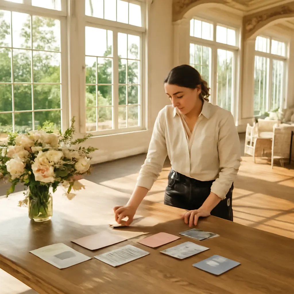
Wedding color harmony begins with the people, place, and feeling a celebration should express—not with a Pinterest palette. Start by considering the venue’s existing colors, the season, lighting, and the couple’s preferences; then choose a small group of colors with clear roles and check how they look together in real materials. This approach makes it easier to build a coherent palette, adapt it for flowers and attire, and avoid costly choices that clash with the setting. It also matters financially: The Knot’s 2024 Real Weddings Study reported an average U.S. wedding spend of $33,000, making early, coordinated decisions useful for keeping décor purchases intentional.
Wedding Color Harmony Begins with Context
Color harmony is the perceived coherence among colors used together. In a wedding, it is not a single formula or a requirement that every detail match; it is a planning method for choosing colors that suit the couple and work with the physical environment. The Pantone Color Institute describes color as a powerful form of communication that can influence mood and perception, while the American Society of Interior Designers explains that color choices interact with light, materials, and surrounding surfaces. Applied to wedding design, those principles mean the palette should be tested in the actual venue and in the elements guests will see together.
Pinterest can help couples collect references, but an image alone cannot show whether a shade will look different under a venue’s warm bulbs, beside its woodwork, or in a florist’s available blooms. Begin with context, then use a palette as a practical guide rather than a rigid rule. The sections below explain how to assess a venue, build a balanced color structure, test choices in real conditions, and translate the result across wedding details.
Venue Assessment Defines Wedding Color Harmony
Venue assessment is the process of identifying a location’s fixed visual features before selecting wedding colors. These include wall and floor colors, architectural finishes, furniture, natural surroundings, and the quality of available light. It is the first step because a wedding palette appears in the same visual space as those elements. A color that works beautifully in a saved photograph may compete with a brick wall, patterned carpet, or green landscape when used in the real venue.
Read the Venue’s Fixed Colors
Fixed colors are features that are difficult or expensive to change, such as stone, flooring, wood, tile, and permanent upholstery. Treat them as part of the palette’s foundation. For example, a historic room with dark wood and warm brass may naturally support cream, muted rose, or deep green, while a bright white gallery can accommodate sharper contrast. The goal is not to copy the room’s colors exactly, but to select shades that complement its undertones and visual weight.
A simple venue audit can include photographs from several angles, notes on dominant colors, and small fabric or paper samples held beside prominent surfaces. The American Society of Interior Designers’ guidance on color and interior environments reinforces the importance of evaluating color in relation to surrounding materials rather than in isolation.
Account for Light and Season
Light changes how colors are perceived. Daylight varies by time, weather, window direction, and season; electric lighting can add warm or cool casts. A pale lavender may look crisp in daylight and gray under warm indoor bulbs, while a saturated red may appear more intense under direct sun. Visit the venue at approximately the time of the ceremony or reception, and examine samples under both natural and installed lighting where possible.
Season is a useful source of context, not a color rule. Spring may bring fresh foliage and soft daylight, while autumn often introduces amber leaves and earlier sunsets. A couple can choose any colors in any season; the practical question is whether the palette works with the landscape, floral availability, and expected lighting. The U.S. Department of Agriculture’s seasonal flower guidance is one resource for checking which blooms are commonly available at different times of year.
Palette Structure Gives Wedding Color Harmony Clarity
Palette structure is the assignment of distinct roles to the colors used in a design. Instead of treating every color as equally prominent, couples can choose a dominant base, supporting colors, and one or more accents. This hierarchy helps the palette feel intentional across a ceremony space, stationery, attire, and tablescape. It also makes decisions easier when a preferred flower or fabric is unavailable in an exact shade.
Choose a Base, Supporting Colors, and Accents
A base color usually occupies the largest visual area, often through linens, attire, or the venue itself. Supporting colors add depth, while accents provide smaller moments of contrast in flowers, ribbons, candles, or printed details. A restrained palette of three to five related colors is often easier to coordinate than a long list, though the right number depends on the venue and design complexity. This is a practical planning guideline, not a universal design law.
For instance, a coastal wedding might use sand or ivory as a base, blue-green as a supporting color, and coral as a small accent. A garden celebration could pair soft green and cream with plum details. In both cases, the palette’s success comes from balance and context, not from using a particular trend or copying a reference image exactly.
Use Color Relationships, Not Just Color Names
Color relationships describe how hues interact. Analogous colors sit near one another on a color wheel and tend to create a calm, blended effect; complementary colors sit opposite one another and create stronger contrast. Monochromatic palettes use variations in lightness and saturation within one hue family. These categories can help couples communicate with vendors, but the same named color can vary substantially by material, dye, screen, and lighting.
A “sage” linen, for example, may lean gray, yellow, or blue, while a “dusty rose” may appear warmer or cooler depending on the fabric. Share physical samples when possible and describe the desired relationship—soft contrast, tonal variation, or a vivid accent—in addition to naming colors. This reduces the risk of assuming that labels guarantee a precise visual match.
Material Testing Validates Wedding Color Harmony
Material testing is the process of viewing proposed colors on the actual or comparable surfaces where they will appear. A digital palette is a useful starting point, but screens display light-emitting color, whereas fabrics, paper, flowers, and paint reflect light differently. Testing helps reveal variation in texture, sheen, scale, and illumination before final orders are placed.
Build a Physical Palette Board
A physical palette board gathers representative samples such as fabric swatches, stationery paper, ribbon, and floral references. Place the samples together in the venue or under lighting similar to the event, then photograph them for comparison. Include neutral materials and a sample of the venue’s dominant finish so the colors are assessed in context. A board is not a substitute for final proofs, but it offers a more reliable check than viewing colors in separate online images.
The process is especially valuable for high-visibility items that will appear together in photographs, such as bridesmaid attire, bouquets, table linens, and ceremony backdrops. If exact color matching is unrealistic—common with natural flowers—aim for a shared undertone or compatible contrast instead.
Check Accessibility and Photographic Contrast
Contrast affects readability and visual distinction. The Web Content Accessibility Guidelines, published by the World Wide Web Consortium, specify a minimum contrast ratio of 4.5:1 for normal text against its background in many digital contexts. That requirement applies to web content, not wedding décor, but it illustrates why low-contrast combinations can be hard to distinguish. Couples can apply the broader lesson to invitations, seating charts, menus, and signage by ensuring text is legible against its background.
Photography also benefits from deliberate contrast. If pale clothing, flowers, and a light backdrop blend together, important details may be less visible in images. Ask the photographer how the venue’s light behaves and review sample combinations at the ceremony location. A small test photograph can reveal color casts or visual merging that are difficult to judge by eye alone.
Wedding Details Carry Color Harmony Across the Event
A cohesive wedding does not require every item to use every palette color. Consistency comes from repeating selected tones and relationships across a few high-impact elements. This allows variation in flowers, attire, and décor while keeping the overall impression connected.
Coordinate Flowers, Attire, and Décor
Flowers are living materials, so their colors and availability can vary by season, growing conditions, and supplier. Rather than demanding an exact match to a digital reference, give the florist a palette range, preferred intensity, and examples of colors to avoid. The florist can then suggest suitable blooms and foliage. Similarly, attire can coordinate through color families, texture, or accessories without requiring every person to wear an identical shade.
For décor, prioritize the largest visual surfaces first: ceremony arrangements, table linens, and focal backdrops. Smaller details such as napkins, ribbons, and place cards can echo the palette without introducing new dominant colors. This order helps couples direct spending toward elements that shape the room most strongly.
Use a Shared Brief for Vendors
A shared color brief is a concise document that records the palette, sample images, material references, and practical notes for vendors. Include color names but also attach physical or manufacturer samples when available. Clarify which colors are essential, which may vary, and where each color should appear. This is particularly useful when a wedding involves separate teams for florals, stationery, rentals, attire, and lighting.
The Knot’s 2024 Real Weddings Study reported a $33,000 average U.S. wedding spend, underscoring why coordinated planning can matter to a budget. A clear brief cannot guarantee savings, but it may reduce avoidable revisions, duplicate purchases, and last-minute substitutions. Couples should still compare vendor proposals and confirm what is included in each quoted price.
Conclusion: Let the Wedding Setting Lead
Wedding color harmony is strongest when it grows from the venue, light, season, and couple’s preferences. Assess fixed surroundings first, establish a simple palette structure, test real materials, and coordinate vendors with a shared brief. These steps turn inspiration into decisions that work in the actual space rather than only on a screen. Before committing to major orders, visit the venue at event time, assemble a physical sample board, and review the palette with key vendors. That is where a wedding’s colors can begin to feel genuinely its own.
Sources: The Knot, 2024 Real Weddings Study, https://www.theknot.com/content/real-weddings-study; Pantone Color Institute, Color Psychology, https://www.pantone.com/articles/color-psychology; American Society of Interior Designers, Color, https://www.asid.org/resources/resources/view/resource-center/130; U.S. Department of Agriculture, Specialty Crops: Cut Flowers, https://www.ams.usda.gov/market-news/ornamental-crops; World Wide Web Consortium, Web Content Accessibility Guidelines (WCAG) 2.2, https://www.w3.org/TR/WCAG22/